
by Matthew Russell - Posted 1 month ago
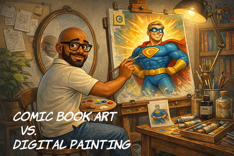
Welcome, my CryptoComics Compatriots. Let’s talk about something that trips up a lot of new artists, collectors, and even readers who are getting deeper into comics for the first time.
People will often look at a finished image and call all of it “comic art,” but that really skips over an important difference. Traditional comic book art style and digital painting are not the same thing. They can overlap, and they absolutely borrow from each other, but they are built to do different jobs.
That difference matters. If you understand what each style is trying to do, you start to see comic pages, covers, and promotional art in a whole new way. You also start to understand why some pages are easy to read and feel exciting, while other images may look beautiful but do not move the story as clearly.
This is not a conversation about one style being better than the other. It is about purpose. In comics, purpose is everything.
Traditional comic book art is built for storytelling first.
As a high school teacher, I hear that phrase all the time from my principal: every lesson needs a big idea. The more I thought about it, the more I realized this is it. Whether I am talking to students in the classroom or readers here on the CryptoComics Marketplace, the core point stays the same. Comic art is not just about making something look impressive. It is about making something read clearly, communicate quickly, and carry the story.
That IS the big idea.
A comic page has a major job to do. It needs to guide your eye from panel to panel. It needs to make characters readable and recognizable. It needs to show action clearly. It needs to create emotion, tension, rhythm, and impact. Most of all, it needs to help the reader understand the story quickly.
That is why traditional comic art usually leans so heavily on clear line work, strong silhouettes, readable acting, and deliberate composition. Every choice on the page is supposed to support the story.

The line art matters. The shadows matter. The placement of black areas matters. Even the way a character is posed inside a panel matters. All of it is there to help the reader move through the page without getting lost.
That is one of the reasons classic comic art has such a strong visual punch. It is not just trying to look cool. It is trying to communicate.
Digital painting usually starts from a different goal. Instead of building the image mainly around line clarity and page readability, digital painting focuses more on light, texture, depth, atmosphere, & rendering. It is usually trying to make the image feel richer, softer, more immersive, or more realistic.
A digital painting can be incredibly powerful. It can create moods in a way that feels almost cinematic. It can make metal feel more like metal, skin feel like skin, and light feel like it is actually wrapping around the character. It can give a piece an emotional tone that hits hard in a single image.

That is why digital painting works so well for cover art, splash pages, posters, promotional illustrations, and character pinups. It invites the viewer to stop and look.
But there is a catch. (There always is…)
A comic page doesn't just need to be looked at. It needs to be read. I know, this opinion is very controversial. Most people say that they buy a comic for the artwork, the artist, and so on. That is true more often than not.
A lot of people absolutely pick up a comic or graphic novel because the art grabs them first (I still have every issue of Jim Lee’s Divine Right: The Adventures of Max Faraday… if you know, you know.).
The cover catches their eye, the style pulls them in, and the visuals make them want to own it. But once that book is open, the art still has to do more than look good. It has to guide the reader, support the pacing, and make the story easy to follow from panel to panel. Great comic art does both. It attracts you first, then it carries you through the read. ## The Role of Line Work
One of the clearest differences between traditional comic art and digital painting is line work.
In traditional comic book art, the line is doing a lot of the heavy lifting. Outlines define the forms. Line weight helps separate foreground from background. Thicker and thinner lines add depth, emphasis, and energy. Clean inking helps the page stay readable even before color is added.
In digital painting, the line is often less important, and sometimes it disappears almost entirely. Forms are built more through value, color, edge control, and brushwork. Instead of a figure being defined by ink, it might be defined by light against shadow or warm tones against cool tones.
That difference changes the entire feel of the image. Comic art tends to feel sharper, bolder, and more immediate. Digital painting tends to feel softer, fuller, and more atmospheric.
Neither one is wrong. They are just built for different jobs. One is trying to tell the story cleanly. The other is trying to make you stop and stare like you just walked past a killer cover on the spinner rack.
Shading is another place where the two styles split drastically!!!
Traditional comic art often uses shadows in a more graphic way (that wasn’t a Graphic Novel pun…I promise). The artist is usually thinking about where to place darks for maximum clarity and drama. Those shadows are often simplified, bold, and intentional. They help sculpt the form, but they also help control readability.
That is why strong comic art can still look powerful even with limited rendering. The shadows are not random decorations. They are structural. Just look at anything drawn by Joseph Wight from Antarctic Press. His work on Teether is absolutely amazing!!!

Collecting David Hutchison’s horror story into one trade paperback, pulling the full saga together in one volume. It is the kind of book that grabs horror readers fast, with a creepy premise, strong atmosphere, and the kind of unsettling energy that sticks with you after you close it.
Digital painting usually pushes further into gradual transitions. Instead of one strong shadow shape, you may see multiple soft passes of light and dark blending into each other. That can make the image feel more realistic or more emotionally rich, but it can also make it less immediate if the artist is not careful.
In a single painted image, that extra realism can be stunning.
Across a full comic page, though, too much soft rendering can start to slow things down. The eye has more to process. Shapes can become less distinct. Panels can lose some of their snap. That is why comic storytelling often rewards simplification.
Color is another place where people sometimes confuse “more” with “better.” In traditional comic page coloring, color is usually there to support the storytelling.
Yes, it can look beautiful. Yes, it can create mood. But it also needs to keep the page readable. It needs to separate characters from backgrounds…most times (looking at you Batman).
It needs to guide the eye. It needs to help each panel feel clear at a glance.
That is why flatter, cleaner color choices can often work better in comics than overly blended ones. The goal is not just to impress. The goal is to help the reader move through the story.
Digital painting often treats color in a more immersive way. It may focus more on subtle temperature shifts, reflected light, texture, atmosphere, and “painterly” transitions. I wasn’t even sure “painterly” was a word, but Grammarly didn’t underline it, so I’m using it.
Again, that can be gorgeous. It can make an image feel alive. But in sequential storytelling, color has to stay disciplined. If every panel is painted like a movie poster, the page may become harder to read, harder to produce consistently, and slower to finish.
And that is a bigger deal than some people think. In comics, if the look keeps bouncing all over the place, the reader feels it.
This is where a lot of beginners get surprised.
A comic page is not judged only by how good one panel looks when you stare at it. It is judged by how well the whole page works when someone reads it. I know, there are exceptions to every rule. Sometimes it is merely the image as shown below, but we are talking in generals now.
Anyway, back to the article…and this means the art needs to function at speed.
The reader should not have to stop and figure out where to look next. They should not be confused about what is happening unless that was the writer’s intent. A strong comic page guides the reader almost invisibly.
Traditional comic art is built for that kind of visual speed. It is designed to be read in sequence. Digital painting is often built for visual impact in a single image.
That is why a painted piece might win the beauty contest while a more line-driven comic page wins the storytelling contest. And in comics, storytelling is the job.
If you are creating a cover, a promo image, a collectible art piece, or a splash page meant to stop someone in their tracks, digital painting can be a huge advantage. It can create a sense of spectacle that grabs attention fast.
Just look at this amazing cover by VailedLightEntertainment. I absolutely love this series, DimensionLock. It is a great example of how a strong cover can stop somebody cold, make them curious, and instantly sell the tone before they have even read page one.

But if you are building twenty pages of interior storytelling, the priorities shift. Clarity, consistency, speed, and readability is much more important.
That is why many artists blend the two approaches depending on the assignment. They may use stronger line-driven storytelling for interior pages and bring in more painterly rendering for covers. Or they may use comic-style line art with subtle painterly coloring on top.
Some of the best modern work lives in that middle ground. The trick is knowing what the image is supposed to do.
Once you understand the difference, you start seeing art choices more clearly. You notice when a cover is designed to be a stand-alone showpiece. You notice when interior art is built for clean narrative flow. You notice when a piece is prioritizing mood over motion, or impact over readability.
That can change how you evaluate what you are looking at. It also helps explain why two pieces from the same comic can feel so different.
A painted cover may promise one visual experience, while the inside pages deliver another. That is not necessarily bait and switch. It is often just two different artistic approaches serving two different jobs. I struggled with this on so many different occasions. I feel that if you are going to have a comic book style artwork on the cover, it should be the interior artist unless it is a variant.
Yes, this is just a personal opinion and a hill that I will die on. It is also an opinion that is not necessarily shared by all the individual members of CryptoComics. We are still a group of individuals, with our own personal opinions.
The strongest comic artists are not usually locked into one extreme. They understand the strengths of traditional comic storytelling, but they also know when painterly techniques can add something valuable.
Maybe that means using dramatic lighting without losing the line work. Maybe it means bringing in a richer painted atmosphere for a dream sequence, a splash page, or a major reveal. Maybe it means keeping the page clear and readable while allowing the colors to do more emotional heavy lifting. (A lot of “Maybes" here.)
That balance is where a lot of modern comic art shines.
If you don’t believe me, check out Mark May’s variant of the Hellbringers Sacred Heart. I love this story and the artwork is absolutely superb.

The danger comes when an artist falls so in love with rendering that storytelling gets weaker. A page can be technically impressive and still fail as a comic page if the reader has to work too hard to understand it.
That is the test. It is one that I have actually failed personally on many occasions. This is why I tend to avoid interior art…well, that and the amount of time it takes. I can barely keep up with everything I have going on as is. Sorry, back to the blog…
I need to ask “Does the art help tell the story, or does it get in the story’s way?”
When you are looking at comic art, or making it yourself, the question is not just:
Does this look good?
The better question is:
What is this image trying to do?
If the goal is storytelling, then clarity has to win.
If the goal is spectacle, mood, or stand-alone impact, then digital painting may be the stronger tool.
Once you start asking that question, you begin to see the difference between art made for reading and art made for lingering. Both matter. Both have value. But they are not the same thing.
Traditional comic book art and digital painting are like two tools in the same toolbox. They can work together, and often do, but they were built with different strengths.
Traditional comic art is designed to carry a story. It relies on line, composition, clarity, and visual rhythm to move the reader forward. Digital painting is designed to create richness, texture, realism, and atmosphere. It can stop the viewer cold and pull them into a single image. The key is understanding the assignment.
A comic page is not just supposed to look impressive. It is supposed to read well. That is the difference that changes everything. And once you see it, you cannot unsee it.

